
WordPress Mobile Performance Optimization Guide
WordPress Performance Optimization for Mobile Devices
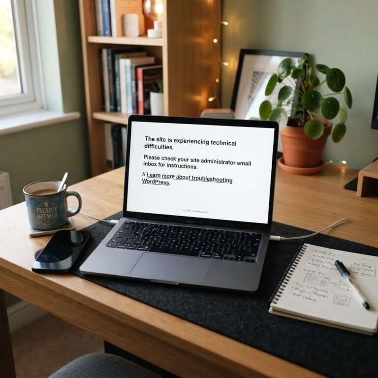
As I sat there at 2 AM, a sinking feeling crept in. I had just finished a late-night project, only to find my WordPress site displaying that dreaded “White Screen of Death.” Just when I thought it couldn’t get worse, I learned my mobile site was slower than molasses. If you’ve ever faced that frustration, you’re not alone! Mobile traffic has taken over, and optimizing your WordPress site for mobile devices isn’t just a good idea anymore—it’s essential!
If your site isn’t optimized for mobile, you risk losing potential customers. A staggering 313% increase in mobile visits compared to desktop means every second counts. If your mobile site has a lag, users will jump ship. Let’s get you moving at lightning speed!
Understanding Mobile Performance Challenges in WordPress
Talking Points:
- Importance of mobile optimization
- Common performance challenges with mobile sites
- Impact of poor performance on user experience
Mobile optimization isn’t merely a checkbox to tick off. The challenges? They can be daunting. First up is the theme you’re using. Not all themes play nice with mobile devices. When I first started with WordPress, I picked a beautiful theme that looked amazing on desktop. But guess what? On my phone? It was like trying to read a book with a flashlight!
Images can also be tricky. Large image files are the culprits behind slow loading times. Picture this—a user clicks on your article after spotting it on social media, only to be greeted by a frustratingly long wait. They’re gone in a flash!
Then there’s site speed. It’s not just a ‘nice-to-have.’ It’s a necessity for mobile performance. Google’s Core Web Vitals are changing the game, and you don’t want to be left behind.
1. Choosing a Mobile-Friendly Theme
Talking Points:
- Characteristics of mobile-friendly themes
- Testing your theme across devices
- Theme providers with solid mobile options
So, where do you begin? Start with your theme. Not all WordPress themes are created equal; some are designed with mobile-first indexing in mind, while others… well, they just don’t care. Look for responsive designs that automatically adjust to different screen sizes.
Bonus tip! Test your theme on various devices to ensure it looks good everywhere. I once spent hours customizing a theme only to realize it wasn’t mobile-friendly. That was a rough lesson!
2. Implementing a Mobile-First Design Approach
Talking Points:
- Key features of mobile-first design
- Benefits of a mobile-first approach
- How it influences user engagement
When considering mobile optimization, embrace a mobile-first design approach. Focus on the mobile user experience before thinking about desktops. This means prioritizing content that matters—those finger-sized buttons and touch-friendly navigation.
To put this into perspective, think of it as laying the foundation of a house. If the foundation is strong, everything else falls into place. Users appreciate a smooth experience, and it often leads to higher conversion rates—trust me, a win-win!
3. Optimizing Images and Media for Mobile
Talking Points:
- Compressing images for faster load times
- Using responsive images
- Alternatives for media types
Ah, the age-old advice: optimize your images! I can’t stress this enough. Wildly large images are like speeding cars on a narrow road—it just doesn’t work. Tools like ImageOptim and TinyPNG have been lifesavers for me. I’ve reduced image sizes without losing quality, and my load times skyrocketed!
Also, consider using responsive images. This allows your website to choose the best image size based on the user’s device. No one, and I mean no one, wants to scroll for ages to find that one image… or even worse, watch a loading circle spin indefinitely.
4. Enhancing Site Speed and Performance
Talking Points:
- Strategies to improve site speed
- Minimizing render-blocking resources
- Tools for measuring performance
Let’s talk speed. Ever been stuck waiting for a website to load? It’s maddening. You want your WordPress site to load in a flash! My go-to tools like GTmetrix have helped me identify bottlenecks. They’re great for spotting things like render-blocking resources that can slow down your site, which I discovered after a frustrating delay.
Implement strategies like minification of CSS and JavaScript, or even lazy loading where images load only when they enter the viewport. It’s a small change with a big impact!
5. Utilizing Caching and Content Delivery Networks (CDNs)
Talking Points:
- What is caching?
- Benefits of using CDNs
- Recommended caching plugins for WordPress
Next up? Caching. Think of it as giving your website a little boost of energy. Tools like W3 Total Cache let your site serve pages faster by storing static versions of your content.
And let’s not forget about CDNs! They distribute your content across various servers worldwide, making it accessible from the nearest location to the user—talk about speedy delivery!
6. Ensuring Responsive and Touch-Friendly Navigation
Talking Points:
- Best practices for mobile navigation
- Importance of touch-friendly elements
- Ways to simplify navigation menus
Now, let’s chat about navigation. Your site’s navigation should be seamless—mobile users should be able to find what they need without frustration. Make sure to opt for touch-friendly navigation elements. I made the mistake of having tiny buttons on my mobile site, and you guess—yes, users were hitting all the wrong tabs repeatedly!
Keep it simple. A clear menu with a few categories is often more effective than trying to cram everything in.
7. Leveraging Accelerated Mobile Pages (AMP)
Talking Points:
- What are Accelerated Mobile Pages (AMP)?
- Advantages of using AMP
- How to implement AMP on WordPress
Ever heard of AMP? It’s a lifesaver, especially for content-heavy sites. AMP helps create faster-loading pages for mobile users. The benefits? Improved load times and potentially higher search ranking. When I adopted AMP for my blog, the difference was huge!
Using a plugin like AMP for WordPress makes implementation straightforward. Your users will appreciate the quick access to your content, and search engines will love your site for it!
8. Monitoring and Testing Mobile Performance Regularly
Talking Points:
- Importance of ongoing monitoring
- Recommended tools for performance testing
- How often to conduct tests
Just like any health check-up, your site needs regular monitoring. Tools like Google PageSpeed Insights can give you invaluable insights into your mobile performance. I check mine monthly—it’s quick, easy, and lets me catch issues before they escalate.
If something’s off, you can promptly address it and keep users happy and engaged.
Conclusion: Achieving Optimal Mobile Performance for Your WordPress Site
Optimizing your WordPress site for mobile devices doesn’t just bear the promise of a better user experience; it’s a necessity in 2023. With mobile traffic at an all-time high, every second counts. From choosing the right theme and optimizing images to improving site speed and implementing AMP, each element serves a critical role in enhancing your site’s performance.
Take a moment to assess your current setup, and don’t hesitate to apply these practical tips. I’d love to hear about your experiences! What worked for you? Let’s chat in the comments below!
Frequently Asked Questions
Q1: How do I know if my WordPress site is mobile-friendly?
A: You can use Google’s Mobile-Friendly Test tool. Just enter your URL, and it’ll tell you if your site meets mobile usability standards.
Q2: What’s the biggest mistake people make with mobile optimization?
A: Many overlook the importance of responsive design. A non-responsive site can drastically impact user experience and conversion rates.
Q3: How often should I test my site’s mobile performance?
A: It’s good practice to check your mobile performance at least once a month or after significant changes to your site.
Q4: Is AMP necessary for all WordPress sites?
A: While not essential for every site, AMP can be beneficial for content-heavy websites like blogs or news sites that need faster loading times.
Q5: Can I use multiple caching plugins on my WordPress site?
A: No, it’s best to use one caching plugin at a time to avoid conflicts. Choose one that suits your needs and stick with it.