Mobile-First Navigation Design Patterns for WordPress Guide
Mobile-First Navigation Design Patterns for WordPress: A Practical Guide
Talking Points:
* Why mobile traffic dominance changed everything.
* The reality of mobile-first indexing for ranking.
* My personal wake-up call with site speed.
I remember sitting in a coffee shop at 2 AM, staring at a site that looked like a train wreck on my phone. Over 50% of your visitors are holding that same phone right now. If your menu is broken, they are gone. Google stopped caring about your desktop layout years ago. Their mobile-first indexing means the version of your site in your pocket is the only one they judge for search rankings. That shift was not a suggestion; it was a mandate. I have fixed thousands of WordPress sites, and the biggest killers of conversions are always navigation elements that fight the thumb.
The Philosophy of Mobile-First Navigation
Talking Points:
* Designing for the palm of the hand.
* Why viewport settings define your success.
* Avoiding the trap of scaling down desktop menus.
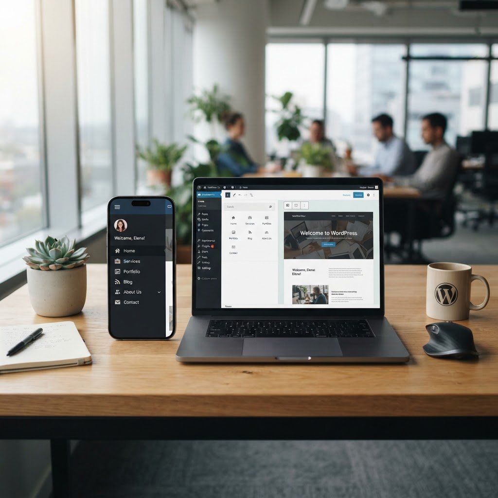
We build for the thumb first. Desktop layouts have the luxury of space, but mobile screens force honesty. You cannot just shrink a horizontal menu and hope for the best. That leads to tiny links and massive bounce rates. You must prioritize content. I see people trying to cram fifteen menu items into a narrow screen. Stop. Think about what a user needs the second they land on your page. If they cannot find the contact page or shop link in two seconds, they exit. Every pixel counts.
Common Mobile Navigation Patterns
Talking Points:
* The debate around hamburger menu usability.
* When to use slide-out panels.
* Why bottom-docked menus are winning for reachability.
Everyone loves the hamburger menu, but it hides your best content. It is a classic example of lazy design. Sure, it looks clean, but it hurts discoverability. Slide-out menus are better, provided they do not cover the entire screen. I prefer bottom-docked menus for certain sites. They sit exactly where the thumb lives. Think about how you hold your phone. You do not reach for the top corners. Bottom-fixed bars put the primary actions right under your grip. This is not about style. This is about physics.
Usability Standards for Smaller Screens
Talking Points:
* Understanding 44×44 pixel touch target minimums.
* Preventing accidental clicks with proper spacing.
* Hierarchy and the rule of progressive disclosure.
If a user misses the link, they blame you. Google says touch targets should be at least 44×44 pixels. Most themes fail this out of the box. I see buttons crammed together like sardines. You need white space. It acts as a safety buffer for the thumb. Use progressive disclosure to show only what matters. Keep the primary path clear. If they need to go deeper, they can click a sub-menu. Do not flood them with options. Less is often everything.
Evaluating Your Theme: Custom vs. Default
Talking Points:
* Why off-the-shelf themes often fail mobile tests.
* The cost of bloated CSS code.
* When to override theme defaults.
I hear developers say their theme is mobile-first. Most of the time, they are lying. Many themes just hide desktop menus on smaller screens and serve a bloated, slow mobile version. I check the CSS media queries for every site I audit. If your theme loads everything for desktop before hiding it for mobile, you are killing your speed. A one-second delay kills conversion rates by 7%. You cannot afford that weight. Sometimes, I rip out the default menu and write custom code just to keep things lean.
Strategic Menu Architecture
Talking Points:
* Prioritizing content for the mobile user journey.
* Why your desktop menu is likely too heavy.
* Using navigation hierarchy to guide users.
Cut the fat. Does a visitor on a phone need to see your ‘About Us’, ‘History’, ‘Team’, and ‘Office Locations’ tabs all at once? No. They want the ‘Get Started’ button. Look at your user engagement metrics. What do people actually click? Put that at the top. Everything else goes into a secondary drawer. You must kill your darlings to make your site usable. If an item is not vital to the goal, move it. Your navigation should be a map, not an encyclopedia.
Performance Impact: Keeping Menus Lightweight
Talking Points:
* Why JavaScript heavy menus kill Core Web Vitals.
* CSS-only solutions vs. JS-based menus.
* Testing speed with real devices.
JavaScript is the enemy of mobile speed. I see plugins that load massive libraries just to animate a menu slide. It is overkill. Use CSS for transitions. It is faster and uses less battery. Your Core Web Vitals scores will thank you. Test your site on a real, old phone. Not an emulator. Does the menu feel snappy? If there is any lag, it is wrong. Fix it now. Speed is a feature.
Testing and Validation: Auditing Like a Pro
Talking Points:
* Why emulators lie about performance.
* Auditing touch target size in real-time.
* Checking menu accessibility for screen readers.
Stop trusting developer tools alone. Pick up your phone. Tap every link. Do you hit the wrong button? That happens more than you think. Use a tool to measure your touch targets. Check if your menu closes when you tap away from it. These small interactions define the user experience. I spend hours on these audits because they are the difference between a high bounce rate and a loyal reader. Be critical. Be mean. Your site will get better.
Common Pitfalls to Avoid
Talking Points:
* The danger of hidden links.
* Why complex sub-menus frustrate users.
* Ignoring accessibility for mobile users.
Stop hiding links in sub-menus that require three taps to reach. If you bury your content, nobody reads it. Another mistake is forgetting the accessibility aspect. If a screen reader cannot parse your menu, you are losing a massive chunk of your audience. Keep the structure flat. One level deep is ideal. Two is the absolute max. Keep it simple, or prepare for users to leave. Complexity is the silent killer of traffic.
Empowering Users Through Seamless Discovery
Talking Points:
* Turning mobile navigation into a conversion tool.
* The importance of consistent updates.
* My invitation to share your navigation wins.
Mobile-first navigation is about respecting your visitor’s time. You give them a clean, fast, and obvious path, and they reward you with their business. It is not about looking cool. It is about working correctly. Your WordPress site is a living thing. Update it. Tweak it. Watch the metrics. If you see a high drop-off rate on mobile, look at your menu first. It is almost always the culprit. Have you tried a bottom-docked menu? Tell me how it worked for your engagement in the comments. I love hearing what actually moves the needle for your site.