WordPress Accessibility Best Practices: A Complete Guide
WordPress Accessibility Best Practices: A No-Nonsense Guide to Inclusive Design
Talking Points:
- Why accessibility impacts nearly every site owner today.
- The legal and financial reality of ignoring your users.
- My personal mistake with a site redesign.
I once spent three weeks building a gorgeous portfolio site for a client. It had sleek animations, tiny gray fonts, and a custom menu that looked like art. Then I watched a friend who uses a screen reader try to open it. He couldn’t even find the home button. My heart sank. That day taught me that a site is broken if it isn’t usable by everyone.
We love to focus on speed and SEO rankings. We worry about core web vitals and plugin bloat. Yet, 95.9 percent of homepages fail basic tests. Those failures turn away people. They cost you money and trust. If you ignore accessibility, you lose out on the 1.2 trillion dollars in disposable income held by people with disabilities. A site should be a welcome mat, not a locked door.
The Gold Standard: Understanding WCAG
Talking Points:
- The four core pillars of WCAG.
- WordPress core and its role in compliance.
- Why you cannot just install a plugin and walk away.
Think of the Web Content Accessibility Guidelines, or WCAG, as the rulebook for inclusive web design. It breaks everything down into four simple pillars: perceivable, operable, understandable, and robust. Your site must offer content users can see or hear. It must function via keyboard, not just a mouse. The logic must be predictable. Finally, it must work with various tools like screen readers.
WordPress core developers do a great job. They keep the backend moving toward WCAG 2.0 AA compliance. But your site is more than just the core software. Your chosen theme and the plugins you install can break that foundation in a heartbeat. I have seen perfectly accessible sites turn into disasters after one bad theme update. You hold the final responsibility for what your users experience.
Your WordPress Accessibility Checklist
Talking Points:
- Immediate steps for basic site health.
- Why you should perform a manual audit.
- Setting a routine for ongoing maintenance.
Start with the low-hanging fruit. Does your site have a skip navigation link? Can you move through every page using only the tab key? Check your font sizes and color contrast ratios. If your gray text on a white background is too faint, you are alienating users who struggle with vision. Fix this today.
Don’t rely on automated tools for a clean sweep. They catch maybe forty percent of problems. I run manual tests on every new site. I unplug my mouse and try to buy a product or fill out a contact form. If I get stuck, the user gets stuck. Make a checklist and run it every time you update your content or design.
Choosing the Right Accessible WordPress Theme
Talking Points:
- Why “accessible-ready” tags can be misleading.
- Testing themes before you commit.
- Finding a balance between beauty and function.
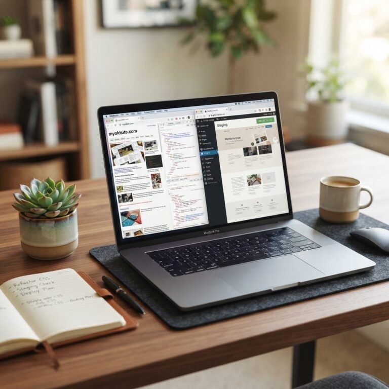
Marketplaces are full of themes that claim to be accessible. Some are great. Others just add a few tags for search results. Never trust a demo site alone. Download the theme and put it into a staging environment. If you cannot navigate the menu with your keyboard, find a different theme. Do not force a broken foundation to work.
Good design is accessible design. You do not need to settle for an ugly site to satisfy standards. Modern accessible WordPress themes exist that look professional and clean. Look for developers who document their accessibility features. If they hide their code, they are likely hiding problems, too.
The Truth About Accessibility Plugins
Talking Points:
- Why overlays rarely work as advertised.
- How plugins interfere with user tools.
- Keeping your site lean and functional.
I get emails daily asking about “instant compliance” plugins. They promise to fix your site with one click. They add an overlay that creates an artificial layer over your content. These often conflict with the specific tools users already have installed. A screen reader user doesn’t need your overlay. They need a site that respects their system settings.
Plugins should be helpers. Use them for things like auto-generating alt tags or checking contrast as you type. Do not use them as a shield against doing the real work. A plugin cannot fix bad semantic HTML or poor layout logic. If it sounds too good to be true, it is.
Mastering Alt Text and Media
Talking Points:
- Why alt text is for meaning, not just keywords.
- The importance of transcripts for video.
- Avoiding “image of” in your descriptions.
Alt text is a gift for users who cannot see your images. Describe the image in ten words or less. If the image is decorative, leave the alt attribute empty. This keeps the experience clean for people using assistive tech. Don’t write “image of a cat.” Write “a tabby cat playing with a red ball.” That provides actual meaning.
Videos and audio need captions. Transcripts help users who are deaf or hard of hearing. They also help search engines understand your video content better. It is a win-win for everyone involved. I keep a simple spreadsheet for every image upload. It takes five extra seconds but saves hours of frustration later.
Designing for Color Contrast and Readability
Talking Points:
- Meeting the 4.5:1 ratio requirement.
- Using typography that works for everyone.
- How color blindness affects user experience.
If you want to improve website accessibility, look at your color palette first. Standard text needs a 4.5:1 ratio. Large headings need 3:1. This isn’t just a suggestion. It is the difference between being readable or invisible. I use free browser extensions to check my contrast while I work. If the checker turns red, I change the hex code immediately.
Font size matters too. Stick to readable sans-serif fonts at a decent scale. Avoid thin, light fonts that wash out. Your users might be viewing your site in bright sunlight on a phone. Clear contrast helps them stay focused on your message. It makes your site look better, not worse.
Keyboard Navigability and Focus
Talking Points:
- Creating clear focus indicators.
- Why you should never disable the outline.
- Avoiding keyboard traps in popups.
Have you ever seen a site with a bright blue box around a link? That is a focus indicator. Some designers hate it because it disrupts their aesthetic. Never remove it. Keyboard users rely on that box to know where they are. If you remove it, they are navigating in the dark.
Test every single popup and menu. Can you close a window without a mouse? If a keyboard user gets stuck in a modal, they will simply leave. That is a massive failure in user experience design. Make sure your tab order flows logically from top to bottom. It should feel like a natural conversation.
Semantic HTML and ARIA Roles
Talking Points:
- Using standard tags for structure.
- How screen readers interpret your code.
- The danger of over-using ARIA labels.
HTML provides the roadmap for a screen reader. Use heading tags correctly. Don’t use a bold tag to create a heading. Use an H2. It helps the reader understand the content hierarchy. Semantic HTML is the strongest foundation for accessibility. It is cleaner, lighter, and easier to read for both humans and bots.
ARIA labels are powerful but often misused. Use them only when native HTML tags cannot describe the element. If you have a custom button, use the right roles. But if you can use a native button, do that instead. Less is more when it comes to code complexity.
Testing and Maintaining Your Site
Talking Points:
- Integrating testing into your workflow.
- Why you should test early and often.
- How to handle legal accessibility audits.
Accessibility is an ongoing process. Every time you add a new post or plugin, you run the risk of breaking something. Perform a quarterly audit of your most popular pages. Use a mix of tools and your own eyes. If you make it part of your routine, it becomes second nature rather than a chore.
With over five thousand lawsuits filed in the US recently, this matters for your bottom line. I take this seriously because I want my clients protected. A happy user is a loyal user. Share your findings with your team. Let me know in the comments how you track your own accessibility progress.